
Est. Reading Time: 8 Mins
Colour is everywhere, shaping how we feel and what we bring into our homes. Whether it’s the soft glow of a winter morning or the warm light of a summer sunset, colour plays a major role in how a space feels and how we live within it.
Trends in colour come and go, often influenced by culture, design, and what people want their homes to express. That’s why furniture stores like La-Z-Boy Ottawa, Gatineau & Kingston pay close attention to emerging colour trends in interior design.
To help guide homeowners through what’s coming next, we spoke with Zeina Badawi, interior designer at La-Z-Boy Kanata, who shares insight into how colour trends are evolving and how to incorporate them in a way that feels comfortable, practical, and personal.
So, what’s trending now, and how might these colours make their way into your living room? Let’s explore the colour trends for 2026 and what to expect this year.
Key Takeaways
- The 2026 colour trends focus on comfort, authenticity, and emotional connection, reflecting how people want their homes to feel.
- Softer pastels and frosted tones bring lightness and calm without overwhelming a space.
- Warm, sunbaked hues add depth and familiarity, creating rooms that feel inviting and lived in.
- Dark colours evolve into rich, restorative shades that feel intentional rather than heavy.
- Grounded greens and elevated neutrals continue to offer versatility and longevity.
- Choosing the right colour palette depends on your space, lifestyle, and how bold or subtle you want your design choices to be.
In This Article...
- The Inspiration Behind Colour Trends for 2026
- Frosted Tints and Soft panels
- Sunbaked Hues with Warm Character
- Restorative Dark Colours
- Grounded Greens Inspired by Nature
- Elevated Neutrals for Everyday Living
- Colour of the Year 2026
The Inspiration Behind Colour Trends for 2026
Before diving into specific palettes, it’s important to understand what’s influencing colour trends this year and why they are appearing now.
As the 2020s continue, homeowners are becoming more intentional with their design choices. Instead of designing spaces purely for aesthetics, people are thinking about how their homes support daily life, rest, and connection. Colour plays a major role in that shift.
“People are getting more comfortable with colour,” says Zeina. “We’re seeing a move away from purely neutral rooms toward colours that evoke emotion, whether that’s calm, warmth, or personality.”
Rather than committing to dramatic changes, many homeowners are choosing to layer colour gradually. Adding depth through fabrics, furniture, and accent walls allows colour to feel approachable and adaptable. This approach makes it easier to evolve a space over time instead of redesigning it all at once.
1. Frosted Tints and Soft Pastels
One of the softer trends emerging in 2026 is the return of pastel-inspired hues, but in a more refined and muted way.
Instead of bright or overly playful pastels, this palette focuses on frosted blues, dusty lavenders, muted greens, and soft purples. These tones feel calm and weightless, making them ideal for spaces meant for rest and focus, such as bedrooms, home offices, and reading areas.
“Frosted pastels add lightness without feeling fragile,” Zeina explains. “When they’re paired with warm neutrals or natural textures, they create a space that feels relaxed and intentional rather than decorative.”
These colours work especially well when layered with warmer materials like wood, woven textures, or soft upholstery. Accent chairs, ottomans, or patterned cushions are easy entry points that allow homeowners to experiment with this palette without fully committing to a single colour across the room.
If you’re interested in learning about La-Z-Boy’s Home Decor Products, take a look at this article.

2. Sunbaked Hues with Warm Character
Warm colours continue to gain momentum in 2026, especially those inspired by sunbaked landscapes and natural materials.
Colours like terracotta, clay, muted coral, buttery yellow, and earthy reds bring depth and familiarity into a space. These tones feel grounded and welcoming, making them a natural fit for living rooms, dining rooms, and other gathering spaces.
“We’re seeing fewer cool greys and more warmth overall,” says Zeina. “Sunbaked colours make a room feel inviting and lived in. They have a nostalgic quality that people really connect with.”
These colours can be introduced in a variety of ways. Some homeowners opt for an accent wall or a statement sofa, while others layer warmth through rugs, artwork, and decorative accents. Even small touches can shift the overall feel of a room and make it feel more dynamic.
To learn more about some Tips for Choosing the Right Sofa Colour, take a look at this article.

3. Restorative Dark Colours
Dark colour palettes continue to evolve in 2026, shifting toward tones that feel rich and calming rather than overwhelming.
Instead of using black, homeowners are leaning into deep browns, charcoal tones, plum-based shades, and dark auburns. These colours add depth and contrast while still feeling warm and comfortable.
“Dark colours can feel incredibly calming when balanced properly,” Zeina notes. “Lighting is key. When you mix in the right lighting and lighter elements, dark colours feel intentional instead of heavy.”
Starting small is often the best approach. Dark cabinetry, accent walls, or upholstered furniture allow homeowners to explore this trend without committing to an entire room. These colours work particularly well in spaces designed for relaxation, such as bedrooms, dens, or media rooms.

4. Grounded Greens Inspired by Nature
Green remains a staple colour in interior design, and in 2026, it leans more grounded and earthy.
Shades such as sage, olive, eucalyptus, and mossy green reflect a desire to bring the outdoors in. These colours feel calming and familiar, while still offering enough depth to make a space feel layered.
“Green is one of the easiest colours to live with,” Zeina says. “It works in so many styles and pairs beautifully with wood, neutrals, and warm accents.”
Grounded greens are versatile enough to be used on walls, furniture, or accessories. They work well in both open spaces and smaller rooms, helping create an atmosphere that feels balanced and connected to nature.

5. Elevated Neutrals for Everyday Living
Neutrals remain an important foundation in home design, but in 2026, they take on more warmth and complexity.
Instead of cool greys, today’s neutrals include warm taupes, creamy beiges, khaki tones, mushroom shades, and soft whites. These colours add a subtle dimension while maintaining a clean and cohesive look.
“Elevated neutrals feel simple, but they aren’t flat,” Zeina explains. “They create a strong base and make it easier to layer in other colours as your style changes.”
This palette is especially effective in open-concept homes where continuity matters. It also allows furniture, artwork, and accent colours to stand out without competing with the walls.

Colour of the Year 2026
Before wrapping up, it’s worth highlighting 2026’s Colour of the Year, as it often reflects the broader direction of design.
One of the most talked-about colours for 2026 is Cloud Dancer, a warm, airy white that emphasizes calm, clarity, and balance. Rather than acting as a focal point, this colour supports other hues and enhances natural light.
“Cloud Dancer feels soft and grounding,” says Zeina. “It allows other colours to stand out while keeping the space feeling cohesive and comfortable.”
This colour works well across many of the palettes discussed in this article. It pairs easily with grounded greens, sunbaked hues, and elevated neutrals, making it a versatile choice for walls, ceilings, and cabinetry.
To learn more about Pantone’s Colour of the Year, take a look at this article.

What's Next?
There’s no telling what’s in store for the future of colour, but with these ideas in mind, there’s no doubt that we’ll begin to see more dynamic ideas in people’s households. If you need help with What Are the Best Colours for Your Home, take a look at this article
So, with that being said, which colour palette speaks more to you? La-Z-Boy Ottawa, Gatineau and Kingston are always aware of the current trends, which is why we want to help you create the home of your dreams.
You can get inspiration today by visiting any of our local furniture stores in Ottawa, Gatineau or Kingston. You can also book an online appointment to talk to a sales consultant if you have any questions or concerns.
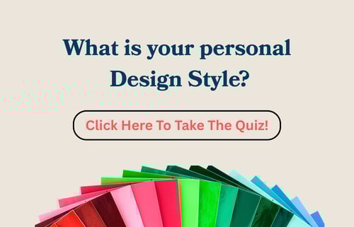
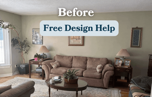
The best way to find out what colour palette suits you more is by checking out our complimentary design services to see how these colours can work in your home. Working with an interior designer can help relieve the stress of doing it yourself and make the process seem effortless.
To learn more about Home Decor in general and how it can help with your colour trend, take a look at our home decor buyer’s guide.
Related articles:
Pantone Colour of the Year 2026
Guide to Choosing the Right Sofa Colour
How to Mix and Match Furniture
(1).jpg?width=150&height=150&name=9C8A3062-Enhanced-NR%20(1)(1).jpg)